Brand Guidelines
This simple kit is for using the CHIP logo that follows our brand guidelines.
Download kitZIP file contain PNG and SVG files
Main Logo
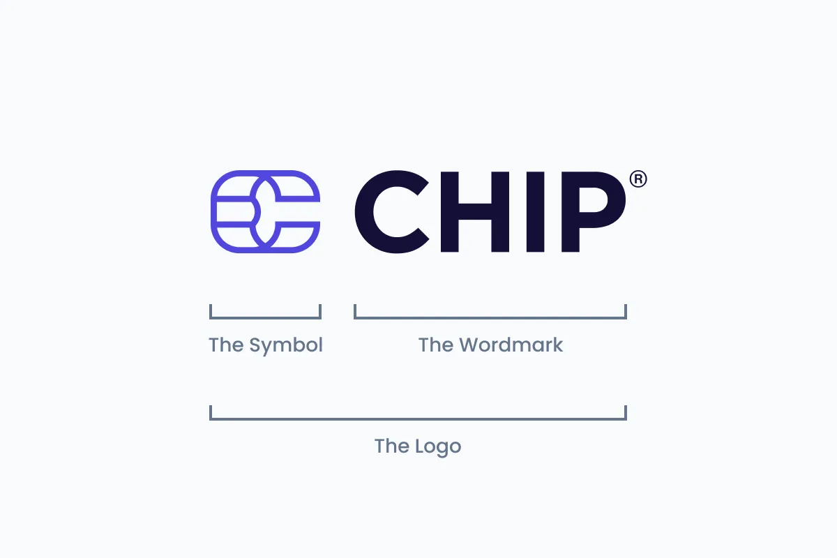
The CHIP logo consist of a "Symbol" and "Wordmark". The Symbol is inspired by the shape of chip on credit card.
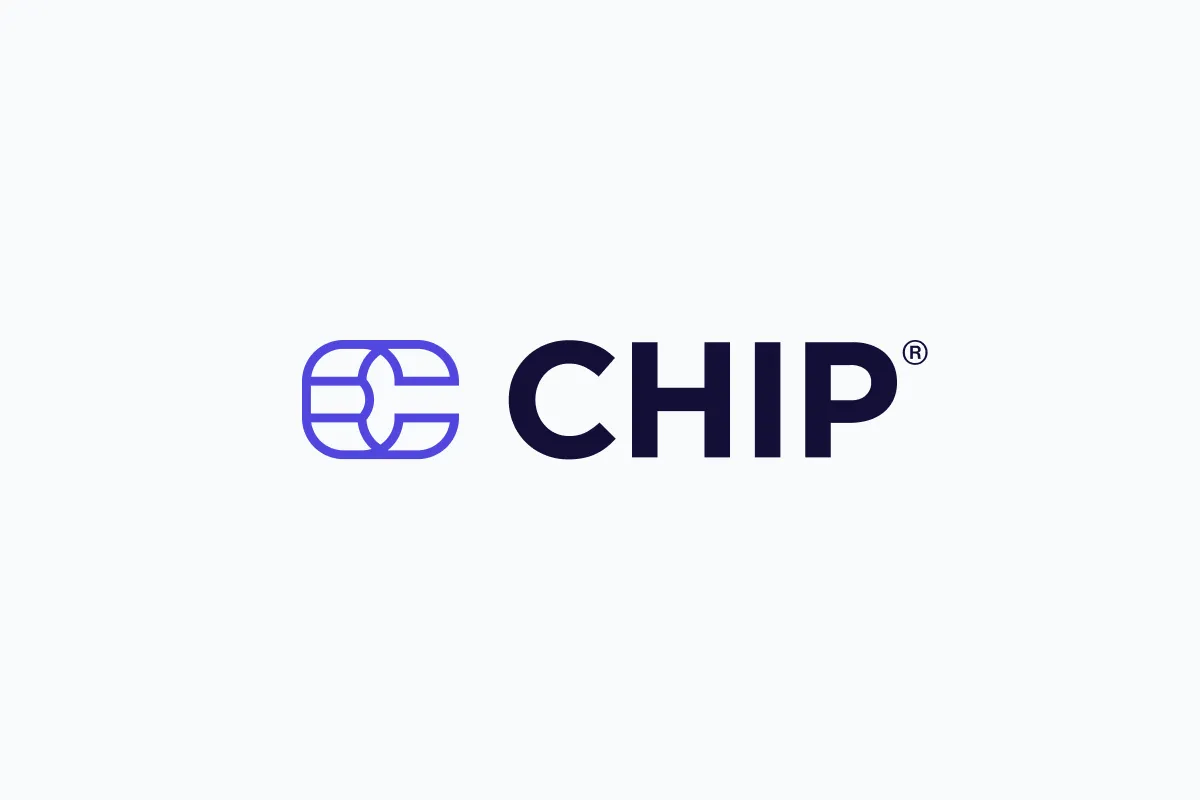
This is our primary logo. Note the "Symbol" and "Wordmark" are horizontally locked.

When the primary logo doesn't fit in tight space, use the "Symbol" logo instead.
Clearspace
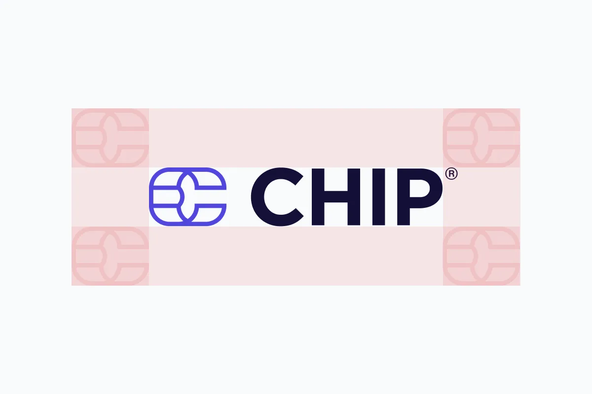
Our logo should always have enough breathing space around it when placing beside another logo or text.
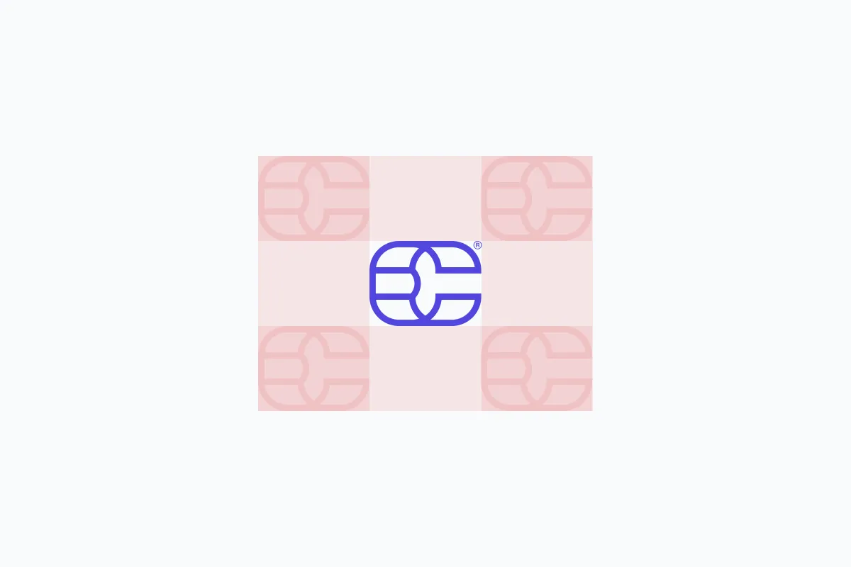
We call the space around our logo the red zone. Do not put anything in it.
Colour
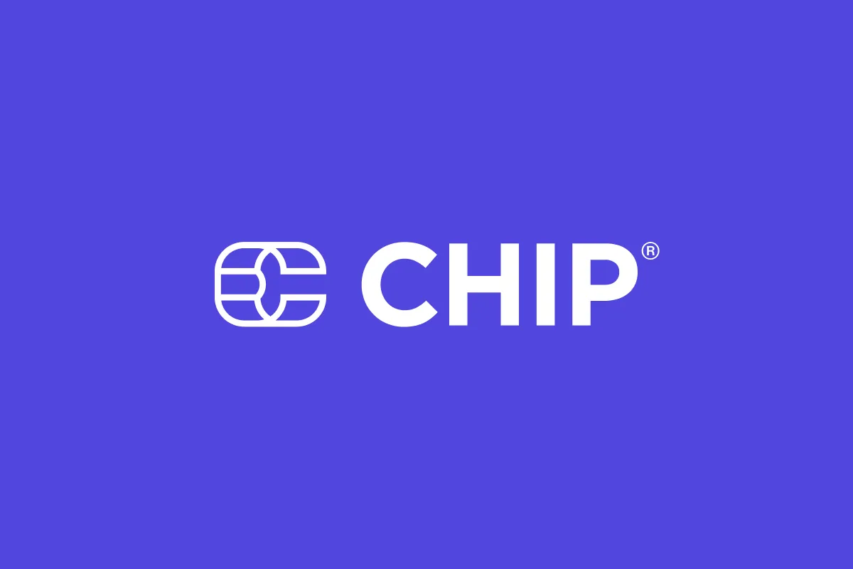
On light background, use our full-colour primary logo. Purple hex code: #5147DD
Dark purple hex code: #140F37
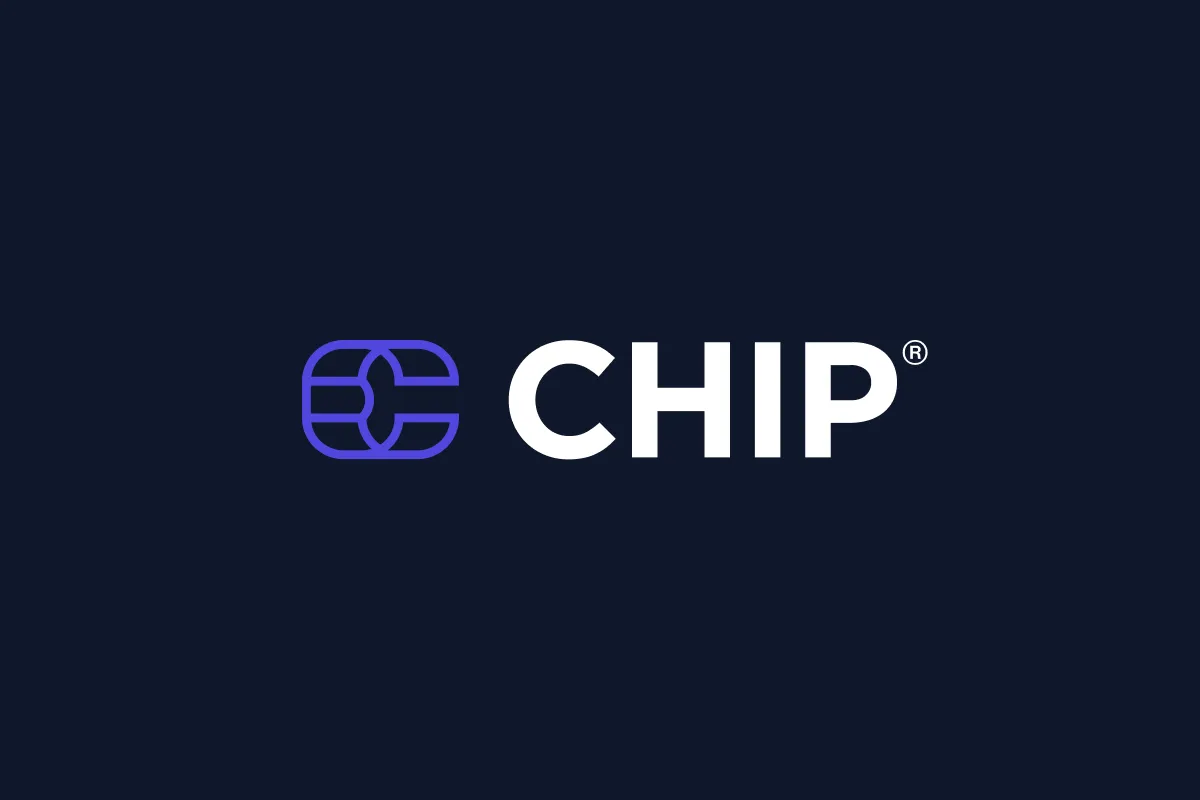
On darker background, use our full-colour primary logo with white (#FFFFFF) "CHIP" wordmark.

Our CHIP purple is our identity, when working on dark background in tight space, use our purple coloured "Symbol".
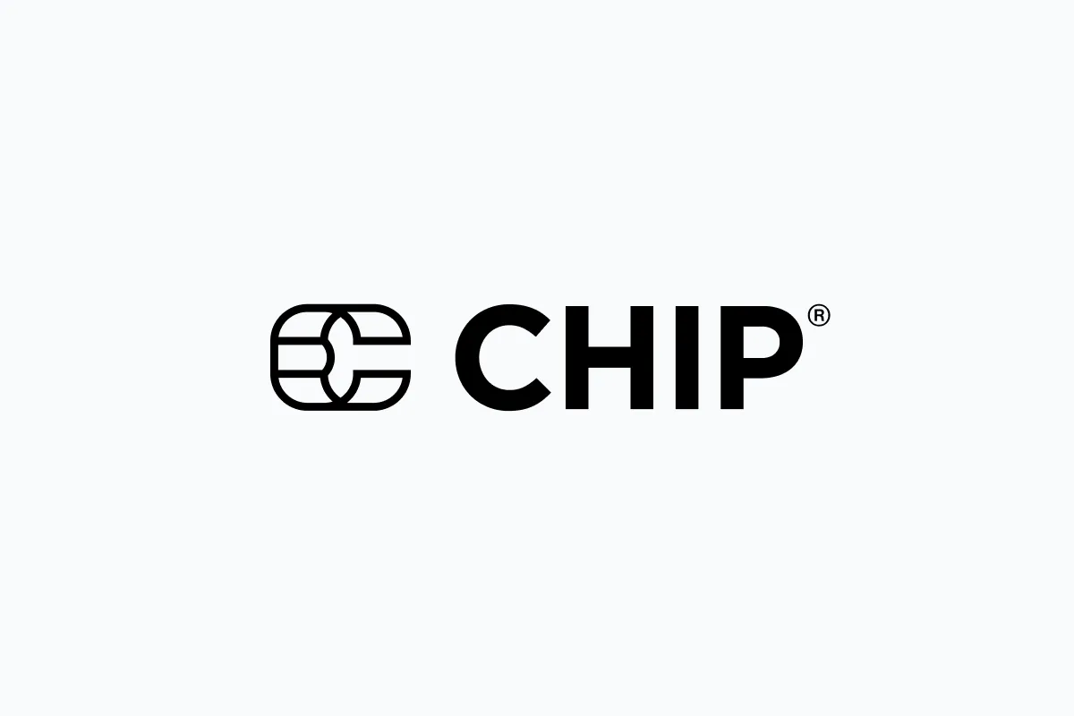
Printing only one colour? Use our black logo.
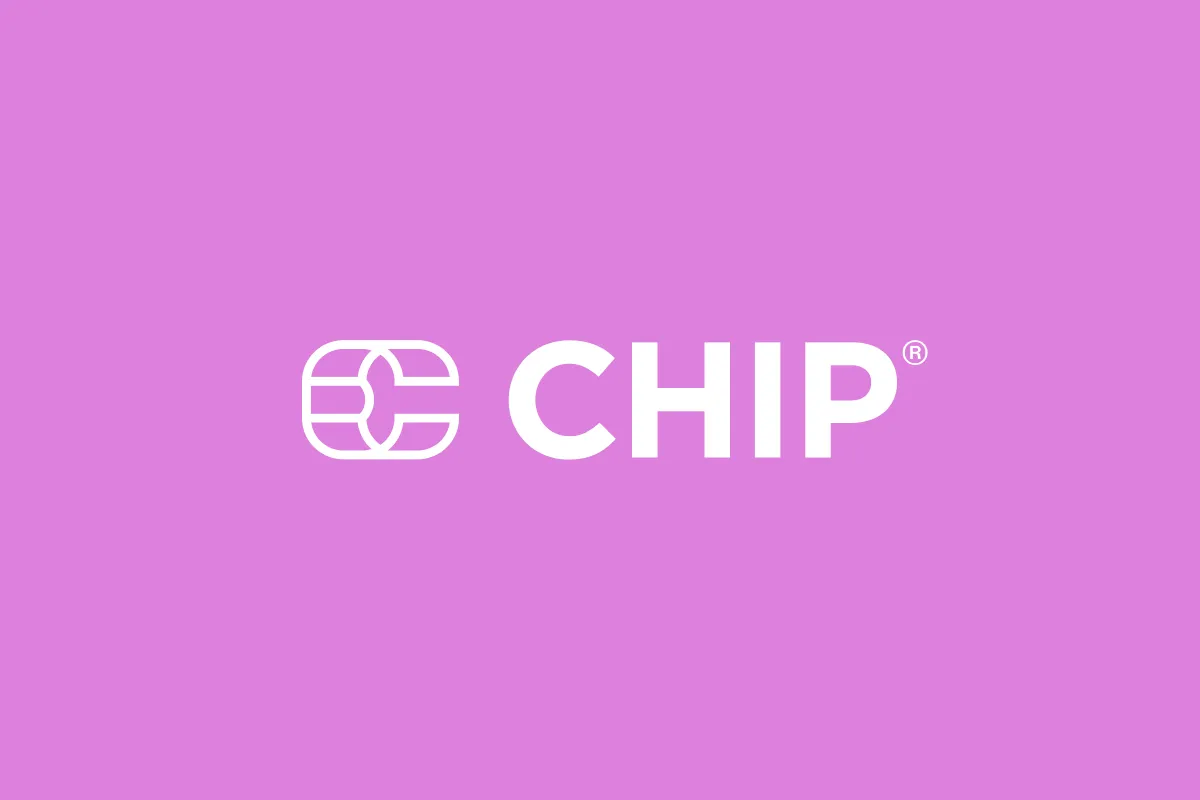
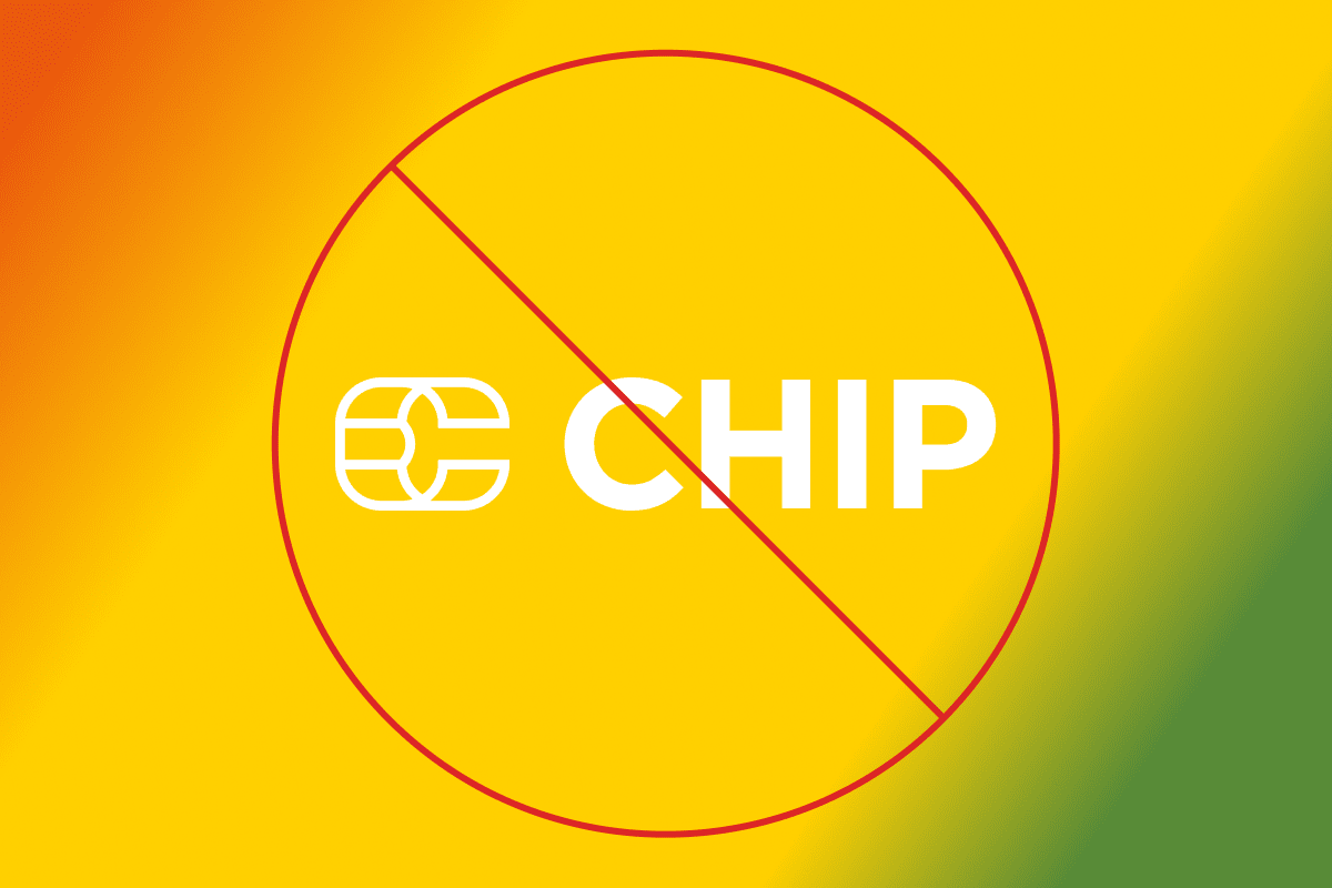
On vibrant coloured background, use our white logo.
On coloured background that clashed with our purple colour, use our white logo.
Pay with CHIP badges
Enhance your customers' checkout experience with the "Pay with CHIP" badges. By displaying these badges, you show your commitment to providing a secure and trustworthy payment environment. Your customers can proceed to checkout with confidence, knowing that their preferred payment method meets our rigorous standards for safety and reliability.
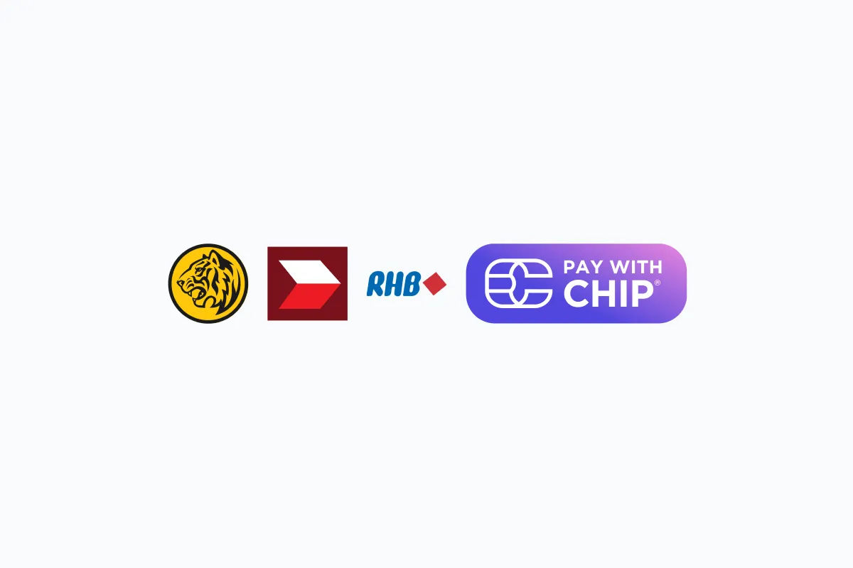
Payment via FPX (Online Banking).
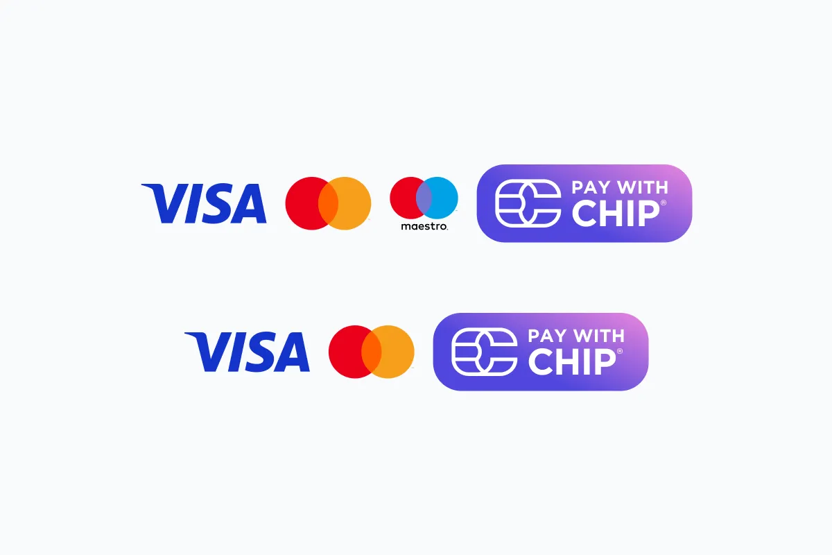
Payment via Foreign and Local Cards.
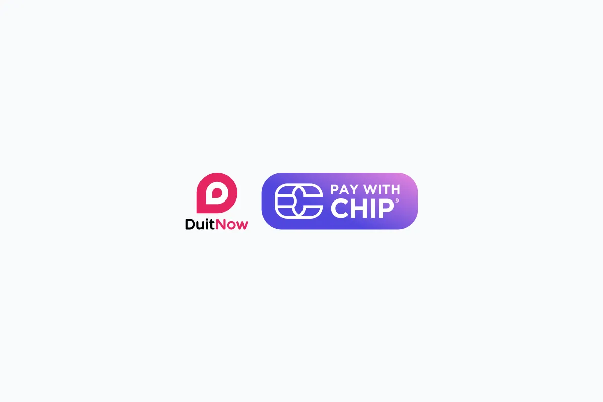
Payment via DuitNow.
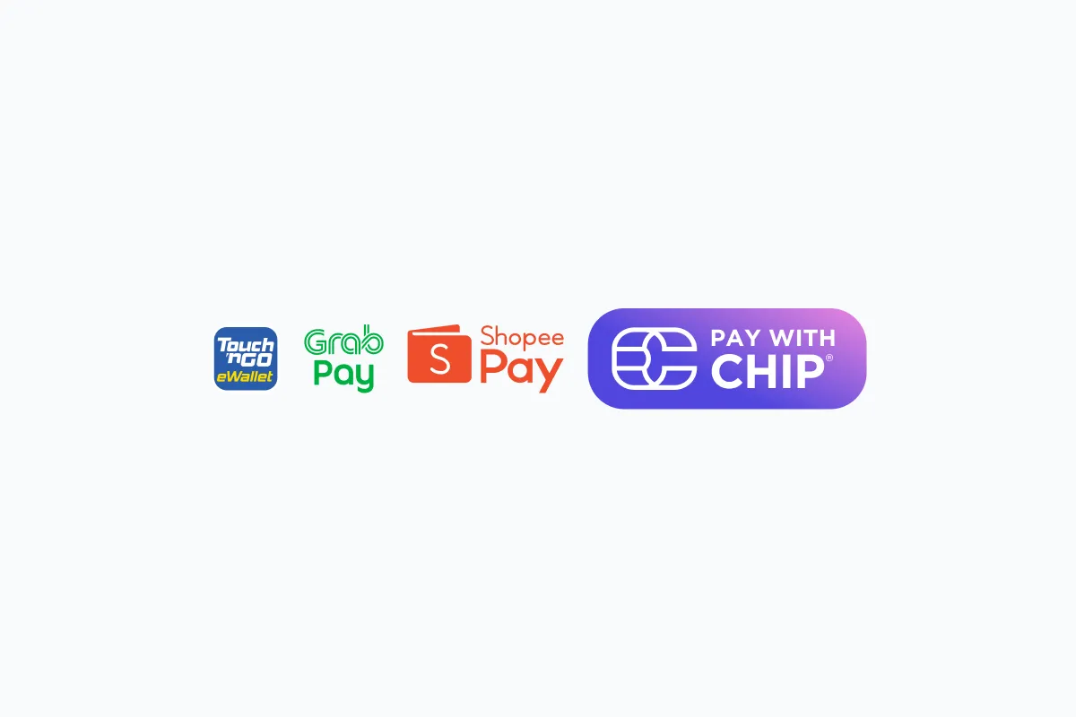
Payment via E-Wallets.
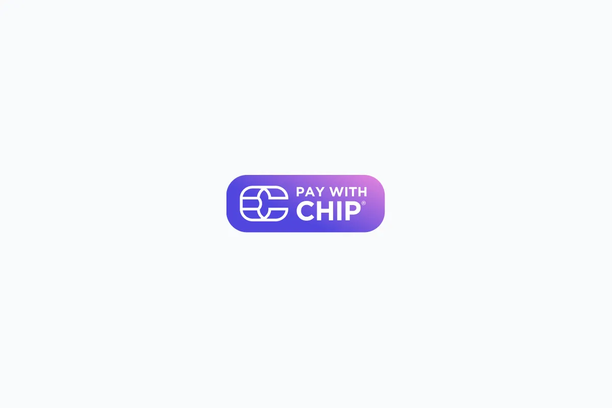
Generic "Pay with CHIP".
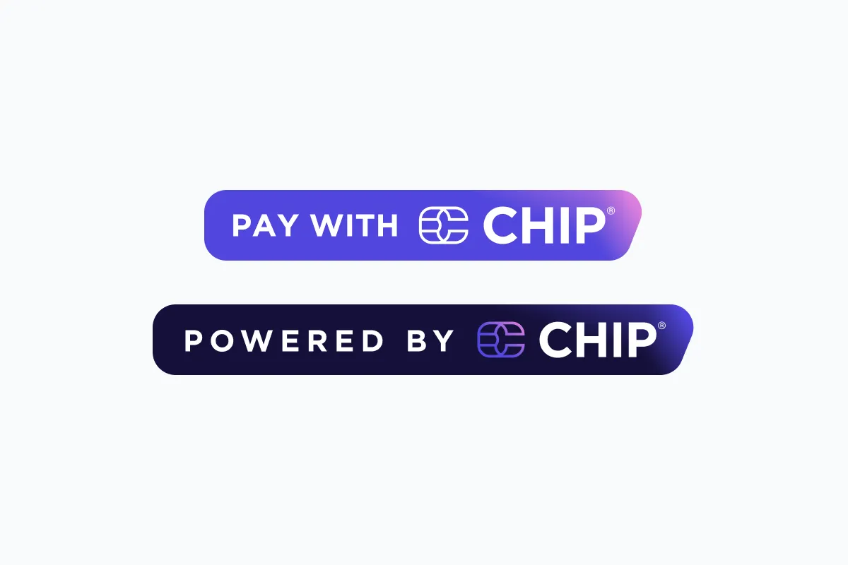
Generic "Pay with CHIP" and "Powered by CHIP" can be used at your website footer.
Payment via FPX(Online Banking) and all payment methods.
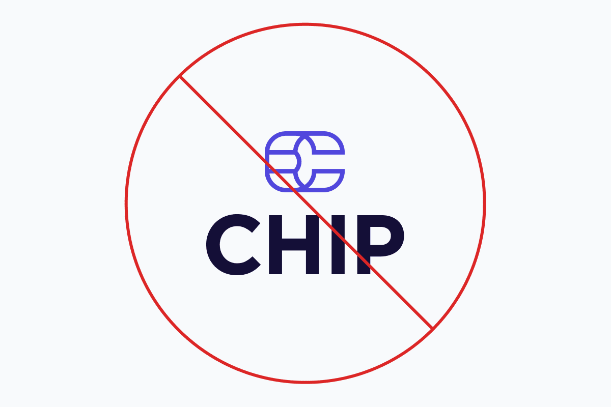
Logo don'ts
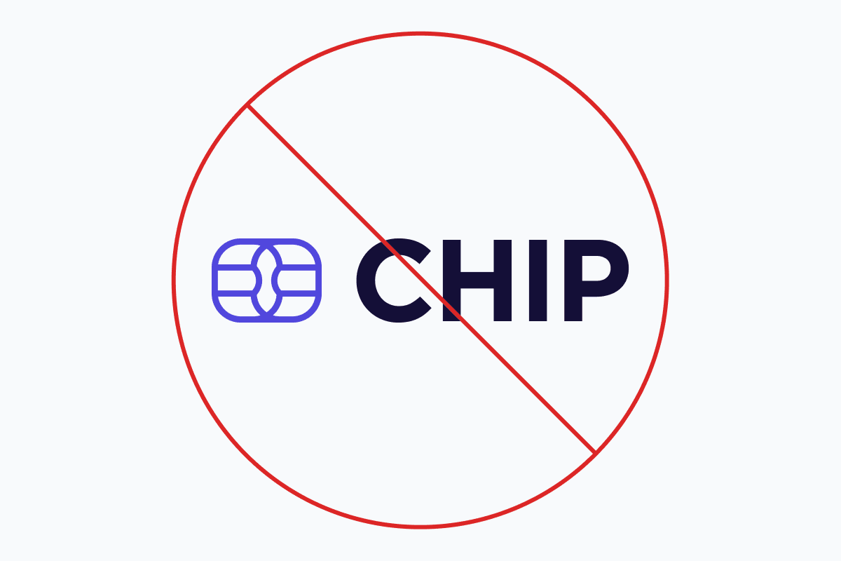
Do not stack the "Symbol" and "Wordmark".
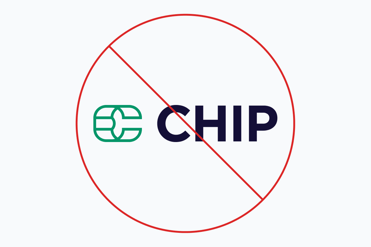
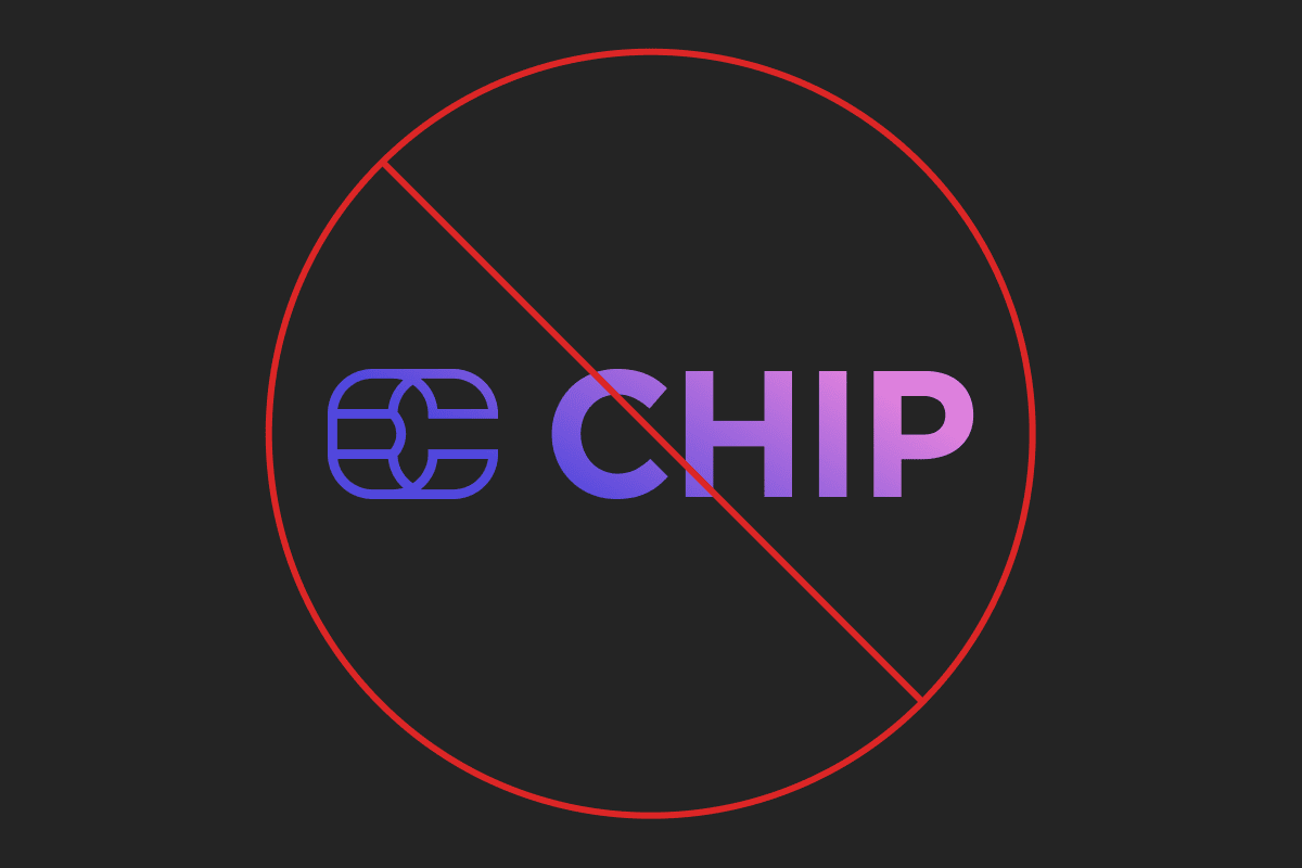
Do not change the CHIP purple colour.
Do not change the shape of "Symbol"
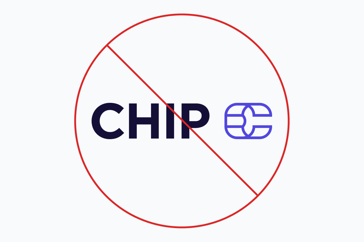
Do not swap position of the "Symbol" and "Wordmark".
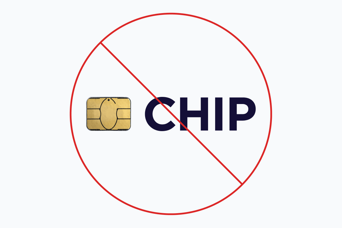
We know the "Symbol" looks like a chip, but do not replace it with an actual chip. 😬
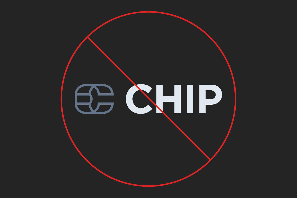
Kindly refrain from using grayscale version of the logo.
We love gradients but do not use other than CHIP purple as the background of our logo.
Do not use gradient on the "Wordmark".
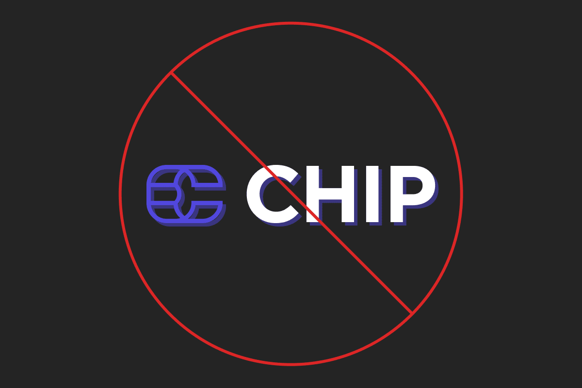
Do not add special effect such as drop shadow and outline on our logo.


